Labels

Showing posts with label Planning. Show all posts

Wednesday, 26 November 2014

Final Front Cover Image...


This is my chosen image for the front cover of my magazine - RUSH. I have chosen it because I really like her pose and her facial expression. She stands out against the pale background with the vivid and bold colours on her jumpsuit and her red lipstick. I plan on editing the image to enhance it and make her stand out further. I also plan on either editing out the background completely on Photoshop or trying to darken it somehow so cover lines will be easier to read and she will also stand out further. I also plan on editing her face - I will get rid of any stray hairs that are on her face and some of her blemishes so it will improve her appearance. I also want my masthead to be partly obscured by her head so I will use Photoshop to do this also.

Successful Possible Images For My Front Cover..

Wednesday, 12 November 2014

Photo Shoot Contact Sheet...


Front Cover Flat Plan...


This is my flat plan for my front cover of my magazine.I plan to have my main image bleeding off the page with cover lines surrounding the image. I want my masthead to go behind the head of my model to create depth and make the cover more interesting with layers and text. Above the mast head I will place the date and the issue number. Throughout construction I may change this layout and add or takeaway from the flat plan to develop my magazine design further.

Contents Page Flat Plan...


This is my flat plan for my contents page. I have included 3 columns - two for text and one for images. This splits the page into three sections which guides the reader on what to read first. As we read left to right and top to bottom having the Features on the left hand side of the page means that people may focus on this first, grabbing their attention and making them want to read the articles. Regular articles and notes from the editor are on the right hand side because people usually expect to see these within a magazine so wouldn't necessarily look for them straight away. I have placed one column in the middle of the page for images, these should grab the readers attention drawing them in to read the articles. I may update this throughout construction. 


Double Page Spread Flat Plan...


Here is a flat plan of my DPS. I have decided to put an image bleeding off the left-hand page - we read left to right meaning that the image will be one of the first things we see. Placing a pull quote over the image of my artist means that people will automatically relate the quote to the artist. On the right-hand page I have placed my header towards the top of the page and a strap line fairly close to the middle of the page. This sections it up creating different view points for the page. I am using three columns in which my interview will be placed, I have done this because I think 1/2 columns looks too sparse whereas 4 columns looks too cluttered. There is also a theory that when we look at a magazine page we often focus on something in the middle and work out way around the page in a '6' or a '9' rotation. So, including a pull quote in the middle of the page means that people will be drawn to it which may then lead them on to read the whole interview.


Tuesday, 11 November 2014

Articles…


Masthead & Signature Experiments…

 Here I have experimented around with patterns within my masthead and if I'm going to use lower of upper case for my sans-serif font. I have also experimented with colours that I may use for my masthead. 


Here I have used my own handwriting to try and create a signature for my main feature artist - Siob Love. I want it to be iconic so people will easily recognise it and relate it back to Siob Love, as she is a new singer on the scene and needs to gain fans to have a successful career.


Made Using IOS App - Scribble 


Planning Magazine Colour Scheme...


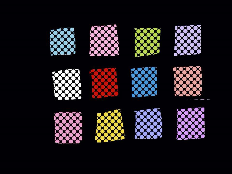
Here I have shown which colours I plan on using throughout my magazine. I aim to use pastel colours - Although they weren't the most popular colour scheme chosen on my questionnaire (3rd most popular, 27.5% of people surveyed decided that they would like to see a pastel colour scheme on a magazine), my magazine will be aimed predominantly towards females, and I feel the pastel colours represent the female gender. I will also be using a monochrome throughout my magazine as 40% of people surveyed chose this as a preferred colour scheme. Throughout construction I shall continue to experiment with colours and decide if I should include the odd bright colour, as 40% of people also said that they would like to see bright and bold colours on magazine. Some brighter and bolder colours I have chosen are shown below...


Made Using IOS App - Scribble