Wednesday, 10 December 2014

Hot Desking...


My music magazine is aimed at 16-24 year olds and mainly females. My front cover is incomplete…

1. What is your favourite aspect of my front cover so far and why?
- Personally I like the font used for the words ‘Siob Love’ as it’s edgy and appealing. It stands out on the page despite being in the same colour as the masthead.
- I like the way the image is edited and how the model is showing direct gaze along with her bright blue eyes which stand out and attract me as a reader
- I like the bold text and simple colour scheme.
- I like the white background as it looks really professional against the black masthead.
- The font of the siob love bit
The highlighted sections of these answers, tell me which aspects of my front cover I should keep the same in order for my magazine to appeal to my target market. It also gives me a slight indication of the things that aren't so good, as these are things that they haven't mentioned.


2. How does the image represent the genre/personality of the artist?
- I think she’s represented as a strong, feminine indie/rock artist. You can tell from the definite stance that she’s powerful and the use of direct gaze really engages our attention and shows some personality.
- I don’t see much relation to an indie genre however the name of the magazine is quite indie and also the way the image is presented could be viewed the same
- The artist looks indie/pop as her style of clothing and the posing shows a bold character.
- The flowers in her top helps to represent the genre, and the direct gaze makes her look interesting.
- She seems quite indie and powerful due to her pose and the jewellery
I am happy with my feedback about the image of my main feature artist. My chosen pose and outfit has represented her well within the indie genre and it also delivers information about her personality which therefor appeals to the reader, and also lets them make a connection with the artist, inciting them to buy the magazine.


3. Is the masthead a good colour/font? Can you read it easily?
- I like the masthead, but think it should maybe be a different colour to the coverlines in order to make it stand out more and ensure that it’s the most recognisable it could be. Nonetheless, it is bold and easy to read.
- The masthead is a good clear colour and font which could be read from afar
- It is easy to read, it is eye catching and bold. It is a good choice to go for plain but simple.
- Yeah it works really well against the background and because of the simple font is very eyecatching and easy to read.
- Yeah masthead is very good
I am again, happy with my feedback about my masthead. I am pleased that it stands out and is bold and clear, which attracts the reader towards my magazine on the shelf. But I have learnt that I should not have my cover lines and masthead in the same colour, as it doesn't help the different fonts to stand out easily. 


4. What improvements can be made?
- For now I just think the addition of more features is the only thing that would improve it!
- Maybe add some coverlines which have some relations to an indie genre
Cover lines and elaboration into the artist on the cover.
More coverlines to let the reader know what’s inside
- I would advise to put the barcode on the left bottom as I think it would look silly on the right.
As the front cover of my magazine wasn't finished, I knew I had to make some amendments to improve my magazine, and add things to complete it. The fact that everyone mentioned the addition of cover lines shows that they want to know whats included within the magazine - whereas if my magazine was more established, it may get away with minimal cover lines, as it would have a large niche target audience, that already know what the magazine includes. 

Front Cover Flat Plan Development...


Main Coverline Decision...


Hover over the Yellow Buttons for text

Final Masthead Decision...


Editing of FC image - using photoshop

You can see the development of my editing on my main image I plan on using for my front cover. I firstly edited the image on PicMonkey and added in an effect, and made the image brighter with more contrast. I then took this image into photoshop, and using a blur and clone tool to make the image more attractive. I also got rid of any stray hairs and make her skin appear more smooth. 

Sunday, 30 November 2014

Improving An Image On Photoshop...


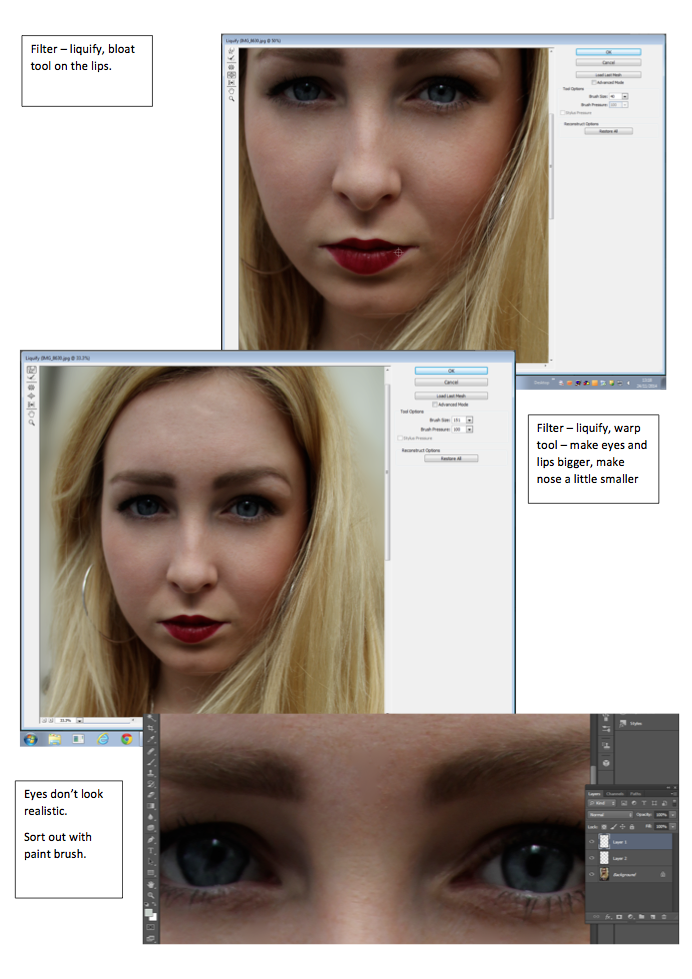
Here, you can see I have gone through a number of small stages to improve my image and alter it to make it seem more 'perfect'. I did this using Photoshop - a software that i'm not familiar to using. But by playing around and spending time experimenting I have developed new skills which will then help me edit my photos for my magazine. On this photograph of Siobhan I firstly blurred out the background to make her stand out further. I also used the spot healing tool and patch healing tool to create smooth and clear skin and also got rid of any stray hairs that were covering certain parts of her face. After that, I used the lasso tool to select half of her eye and copy and pasted in into a new layer. I then dragged this new eye layer down making her eyes look bigger - giving a 'disney eye' effect to the photo. I then Liquified the photo, this means that I can move any part of the photo using a bloat tool - making parts of the image bigger and also the Warp tool - moving parts of the image around. I used both of these tools to shorten her nose and also enlarge her lips. I also used these tools to make her eyes even bigger. After I had done this, I noticed that her eyes didn't look realistic and you could see a clear line where I had made them bigger. So to fix this, I used my paint brush tool, by copying colours of the eye that were already there I created new lines making the pupils line up and therefor looking more realistic. I also used the clone tool to copy and paste parts of the eye that were more complex. Overall she looks more airbrushed and I have tried to 'perfect' the image. I am happy with the results and doing this has given me more confidence to use photoshop to edit and manipulate images.


Wednesday, 26 November 2014

Final Front Cover Image...


This is my chosen image for the front cover of my magazine - RUSH. I have chosen it because I really like her pose and her facial expression. She stands out against the pale background with the vivid and bold colours on her jumpsuit and her red lipstick. I plan on editing the image to enhance it and make her stand out further. I also plan on either editing out the background completely on Photoshop or trying to darken it somehow so cover lines will be easier to read and she will also stand out further. I also plan on editing her face - I will get rid of any stray hairs that are on her face and some of her blemishes so it will improve her appearance. I also want my masthead to be partly obscured by her head so I will use Photoshop to do this also.

Successful Possible Images For My Front Cover..

Wednesday, 12 November 2014

Photo Shoot Contact Sheet...


Front Cover Flat Plan...


This is my flat plan for my front cover of my magazine.I plan to have my main image bleeding off the page with cover lines surrounding the image. I want my masthead to go behind the head of my model to create depth and make the cover more interesting with layers and text. Above the mast head I will place the date and the issue number. Throughout construction I may change this layout and add or takeaway from the flat plan to develop my magazine design further.

Contents Page Flat Plan...


This is my flat plan for my contents page. I have included 3 columns - two for text and one for images. This splits the page into three sections which guides the reader on what to read first. As we read left to right and top to bottom having the Features on the left hand side of the page means that people may focus on this first, grabbing their attention and making them want to read the articles. Regular articles and notes from the editor are on the right hand side because people usually expect to see these within a magazine so wouldn't necessarily look for them straight away. I have placed one column in the middle of the page for images, these should grab the readers attention drawing them in to read the articles. I may update this throughout construction. 


Double Page Spread Flat Plan...


Here is a flat plan of my DPS. I have decided to put an image bleeding off the left-hand page - we read left to right meaning that the image will be one of the first things we see. Placing a pull quote over the image of my artist means that people will automatically relate the quote to the artist. On the right-hand page I have placed my header towards the top of the page and a strap line fairly close to the middle of the page. This sections it up creating different view points for the page. I am using three columns in which my interview will be placed, I have done this because I think 1/2 columns looks too sparse whereas 4 columns looks too cluttered. There is also a theory that when we look at a magazine page we often focus on something in the middle and work out way around the page in a '6' or a '9' rotation. So, including a pull quote in the middle of the page means that people will be drawn to it which may then lead them on to read the whole interview.


Tuesday, 11 November 2014

Articles…


Masthead & Signature Experiments…

 Here I have experimented around with patterns within my masthead and if I'm going to use lower of upper case for my sans-serif font. I have also experimented with colours that I may use for my masthead. 


Here I have used my own handwriting to try and create a signature for my main feature artist - Siob Love. I want it to be iconic so people will easily recognise it and relate it back to Siob Love, as she is a new singer on the scene and needs to gain fans to have a successful career.


Made Using IOS App - Scribble 


Planning Magazine Colour Scheme...


Here I have shown which colours I plan on using throughout my magazine. I aim to use pastel colours - Although they weren't the most popular colour scheme chosen on my questionnaire (3rd most popular, 27.5% of people surveyed decided that they would like to see a pastel colour scheme on a magazine), my magazine will be aimed predominantly towards females, and I feel the pastel colours represent the female gender. I will also be using a monochrome throughout my magazine as 40% of people surveyed chose this as a preferred colour scheme. Throughout construction I shall continue to experiment with colours and decide if I should include the odd bright colour, as 40% of people also said that they would like to see bright and bold colours on magazine. Some brighter and bolder colours I have chosen are shown below...


Made Using IOS App - Scribble


Saturday, 1 November 2014

Magazine Masthead Ideas…

(Hover over the blue buttons to see text)

Mood Board


Here I have created a mood board to express my ideas and thoughts of what I want my magazine to be like. As you can see I like pastel colours combined with portraits. I also like simple but hand writing style fonts as they look quirky and modern which is what I want my magazine to be like. 

Wednesday, 15 October 2014

Thursday, 25 September 2014

Final Image

This is the image of Maisie I have decided to use for my front cover. I think the space above her head and the space on her left is ideal for a mast head and cover lines to fit in perfectly. I don't like the floor, but I am going to Photoshop that out. I also think the sloping wooden wall would be a good place to place my mast head in a quirky fashion.